Simple Ways to Make Pixel Art Look Sharp in Unity
RoboVDino » Devlog
A few weeks ago on the @RoboVDino Twitter, I retweeted this excellent thread by @Davitsu. I had already implemented most of the tips in the thread, but this one tip really helped me out:
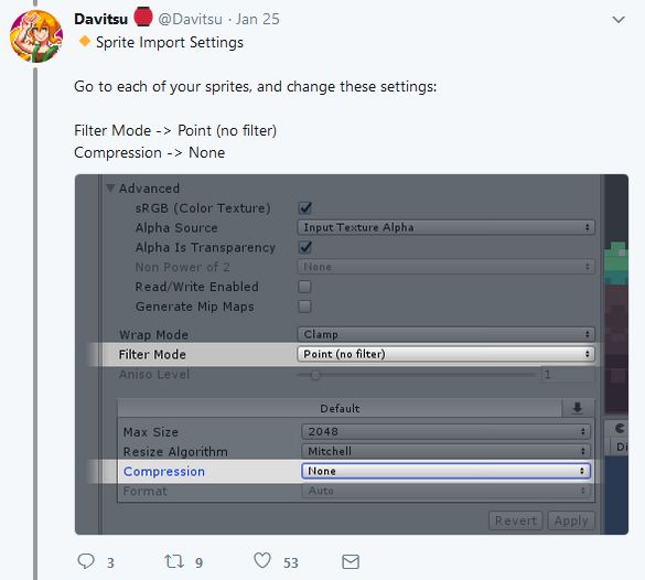
I had already disabled filtering, but by disabling compression on sprite import, this is the difference it made for RoboVDino:
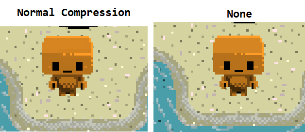
...proportions were fixed...

...missing details were now back...
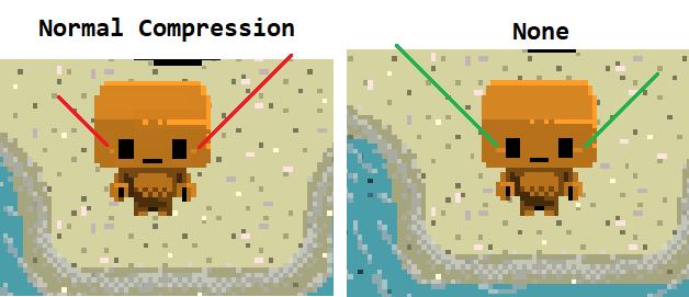
...and the weird mid-tones blurring around details were removed!
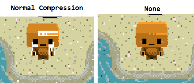
They're minor details, but that's the nature of pixel art. Continuous refinement can get you very far in improving the look of a character. Just look at how today's Filo looks compared to a year ago!
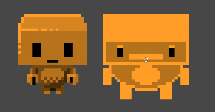
Besides polished pixels, RoboVDino has been making lots of progress. If you follow our Twitter, you'll see new animations, characters, and even maps!
Get RoboVDino
Buy Now$4.99 USD or more
RoboVDino
Throw Garbage At Dinosaurs!
| Status | Released |
| Author | Alex Bair Games |
| Genre | Action |
| Tags | Arcade, Cute, Dinosaurs, Local Co-Op, Local multiplayer, Multiplayer, party-game, Pixel Art, Robots, Top-Down |
| Languages | English |
| Accessibility | One button |
More posts
- V1.2! Come get your donut and bug fixes!Dec 19, 2019
- v.1.1 update and come see us at the Portland Retro Gaming Expo 2018!Oct 19, 2018
- Stegosaurus Sneak Peek!Jul 14, 2018
- RoboVDino is out!Jun 19, 2018
- One Year Gamedeversary + RoboVDino Shirts!?!May 01, 2018
- Emerald City Comic Con 2018!Feb 23, 2018

Leave a comment
Log in with itch.io to leave a comment.