Menu and Store Background
I think one of the best tools a game developer has to promote their game is their store presence. An often overlooked part of that store presence is an attractive background that says something about the game without acting as a distraction. I really liked Reptoid Games' Fossil Hunters Steam store page:
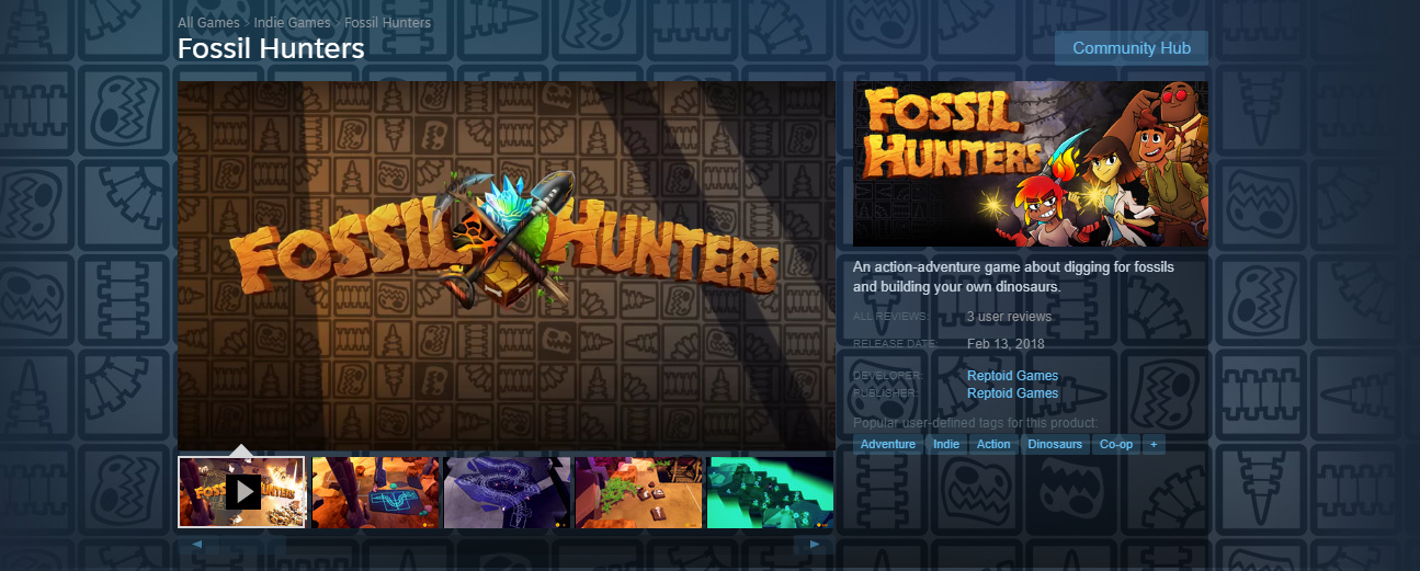
Looking at Fossil Hunters' store page, they nailed every piece of art on the page, but that background stands out. It says something about the mechanics, the theme, and it does that with art that won't distract from the store content.
Oh, and if RoboVDino is your kind of thing, absolutely check out Fossil Hunters!
For RoboVDino's store page, I decided I wanted to have the same approach of something that depicted game mechanics and the theme. The core unit of all gameplay in RoboVDino is the junk you pick up to throw at dinos, so this is what I went with:
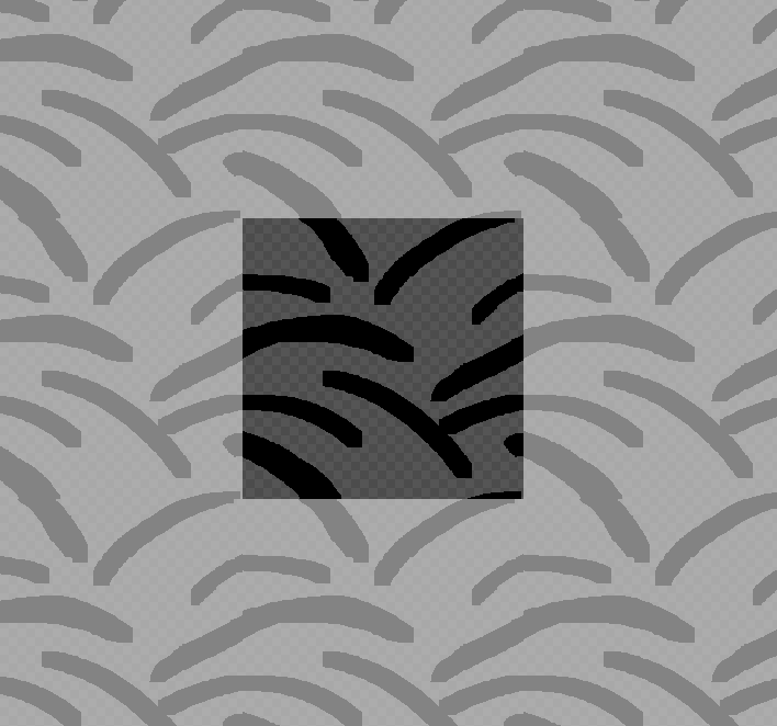
I started with some rough "throw trajectory" swooshes in my preferred pixel art tool, Piskel. Tiling the background would give me good flexibility in the places I could use the background I create in Itch.io, Steam, my desktop wallpaper, and... maybe even in-game!
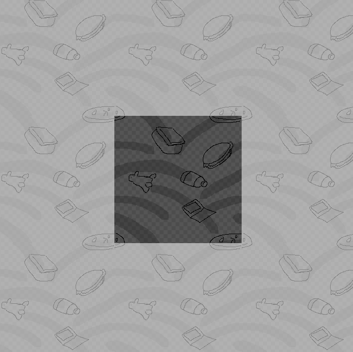
Next, I doodled in some of the stuff you can find in RoboVDino. I tried to place them so they wouldn't look like they were in grid formation. I spoiled the illusion of non-repetition by nudging the pizza into all 4 corners, since that made the pizza align vertically and horizontally. Pixel art lifehack: I drew the pizza as one piece and then cut it into 4 pieces to shove into the corners.
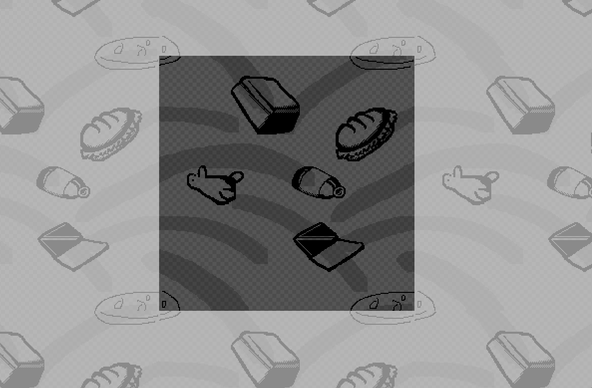
I decided I wanted to keep all of this 1 color with a transparency so that I could use this graphic against any non-100% black background. So, I added a little depth and shading with heavy lines and slight dithering.
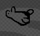
If Portlandia taught me anything, it's that the secret to making something good is to put a bird on it.
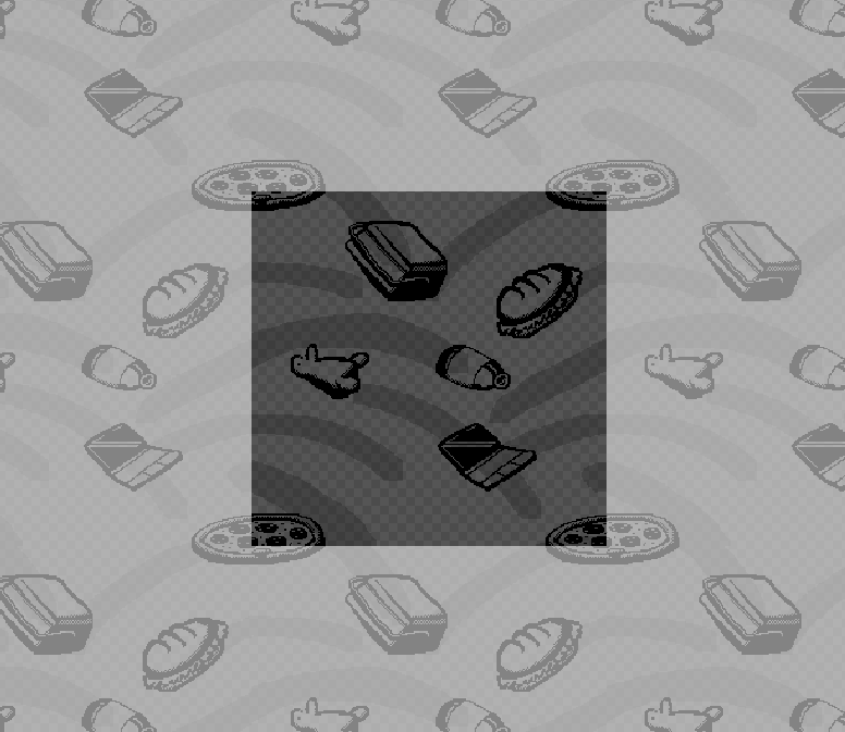
I had originally planned on cleaning the lines up on these to look more realistic, but the more I added detail, the more I liked the marker-drawn look. I generally don't think pixel art (or even raster graphics, for that matter) lends itself well to any hand-drawn look, but I felt like this was approaching what I wanted.
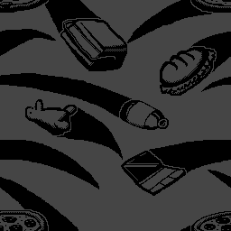
Finally, I decided to make the swooshes taper into thin tails to look more like throw trajectories, added a 1 pixel gap around all the stuff, and ta-da! You can see how it tiles by looking to your left or to your right :)
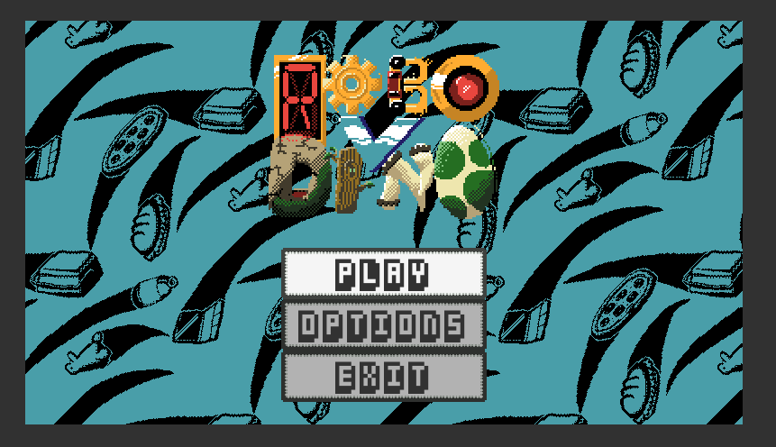
Finally, I had one other thing I wanted to do with my new background, RoboVDino needed some kind of background for the main menu. I used this excellent video to convert my background into a tiled texture that scrolls:
And here is how it looks in-game (give it a click to see the Twitter video!):
Get RoboVDino
RoboVDino
Throw Garbage At Dinosaurs!
| Status | Released |
| Author | Alex Bair Games |
| Genre | Action |
| Tags | Arcade, Cute, Dinosaurs, Local Co-Op, Local multiplayer, Multiplayer, party-game, Pixel Art, Robots, Top-Down |
| Languages | English |
| Accessibility | One button |
More posts
- V1.2! Come get your donut and bug fixes!Dec 19, 2019
- v.1.1 update and come see us at the Portland Retro Gaming Expo 2018!Oct 19, 2018
- Stegosaurus Sneak Peek!Jul 14, 2018
- RoboVDino is out!Jun 19, 2018
- One Year Gamedeversary + RoboVDino Shirts!?!May 01, 2018
- Emerald City Comic Con 2018!Feb 23, 2018

Leave a comment
Log in with itch.io to leave a comment.